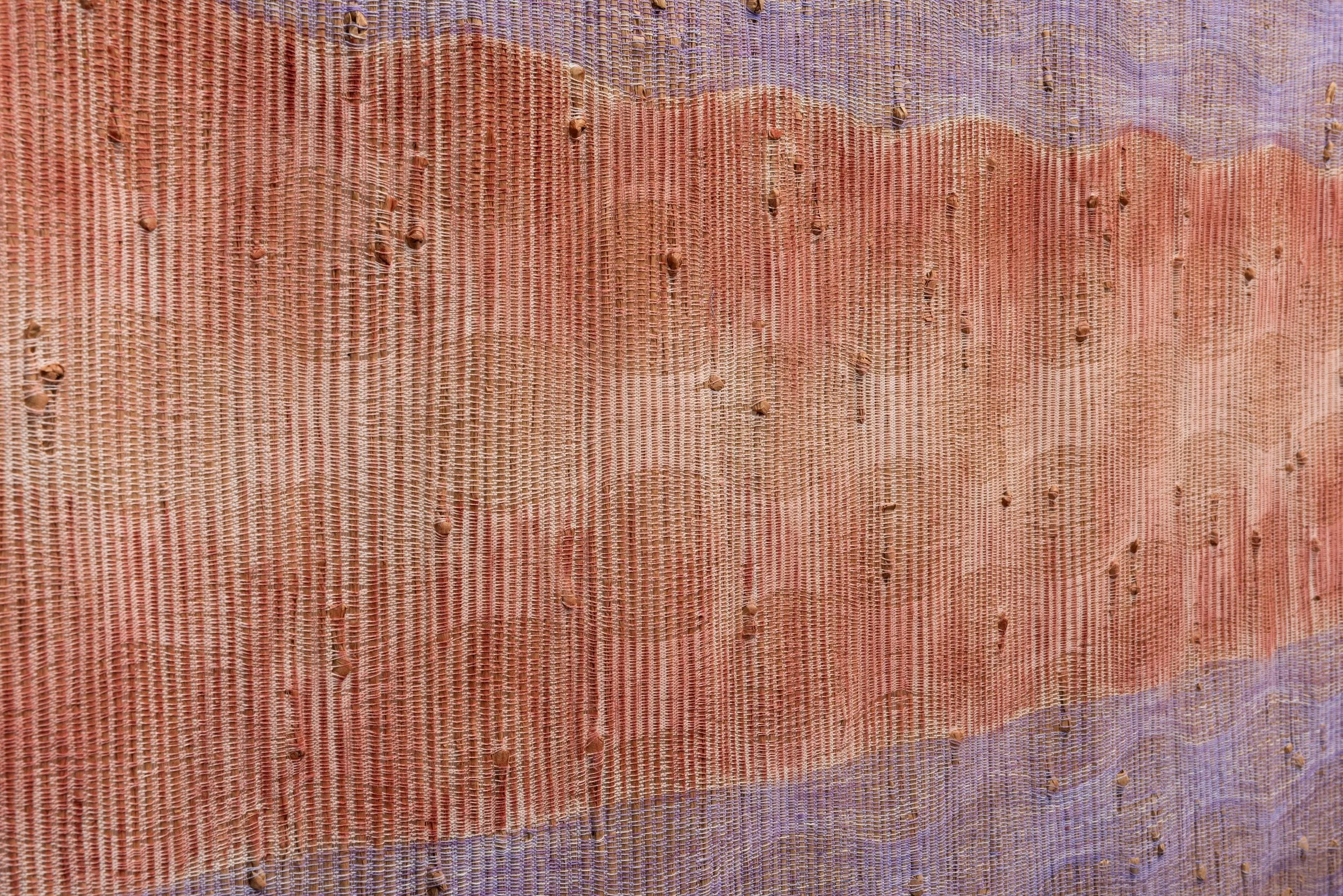
detail of Sacred Erosion
There’s something magnetic about decay—the quiet beauty in what’s falling apart. When I began designing a series inspired by rusty nails, human aging, transcendence, and salt, I wasn’t seeking perfection. I wanted to touch the processes that change us—the slow oxidations of body, metal, and memory—and translate those into color and texture.
Rust and Aging: Parallel Transformations
Rust is metal’s version of aging: a surface reaction, irreversible, rich in color and history. Like skin, it reveals the story of exposure—oxygen, moisture, time. I found this parallel comforting rather than tragic. Both are marks of life’s presence.
In color, rust became the heart of the palette: iron oxide reds, burnt oranges, and bruised browns, layered over cooler undercurrents of silver-gray and bone white. These tones speak of time not as an ending, but as a continuum. When woven, they shift subtly depending on light—just as skin does when touched by age or emotion.

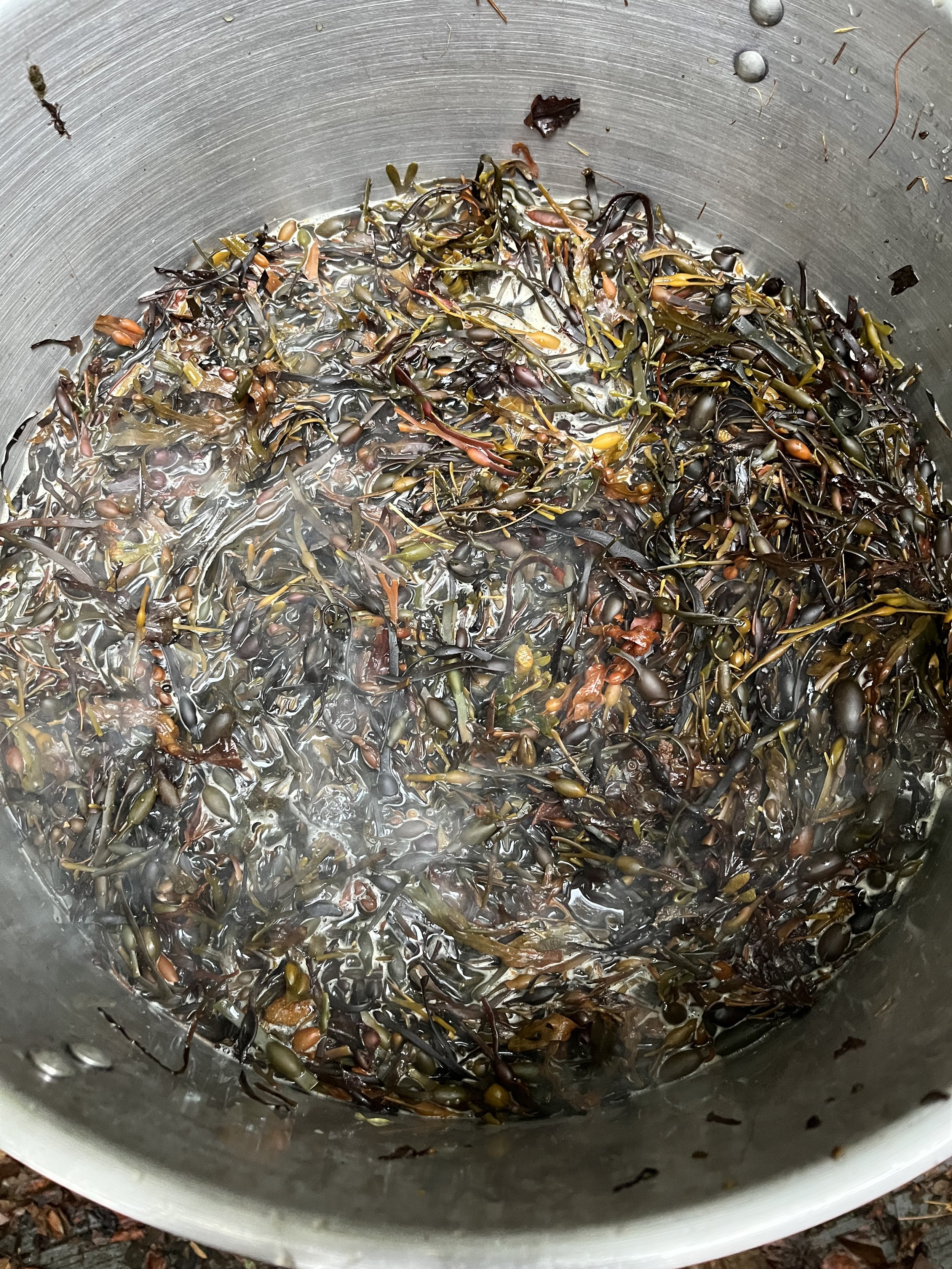
detail of Selkie
The Texture of Salt
Salt is both preservative and corrosive—a paradox I wanted to express materially. In the textile’s surface, I worked to evoke that tension: coarse linen mingled with lustrous silk, threads stiffened in places by mineral washes, and crystalline patterns emerging like frost or residue.
Transcendence Through Breakdown
Lavender is the color of Transcendence. The palette of violet, rust, and salt moves between matte and shine, opacity and translucence, suggesting the movement between the physical and the transcendent.
In the end, the textiles aren’t about decay or preservation, but about the beauty of transformation—the alchemy of materials that echo our own human processes. Rust, salt, and time each remind us that endurance is not the opposite of change; it’s made possible by it.
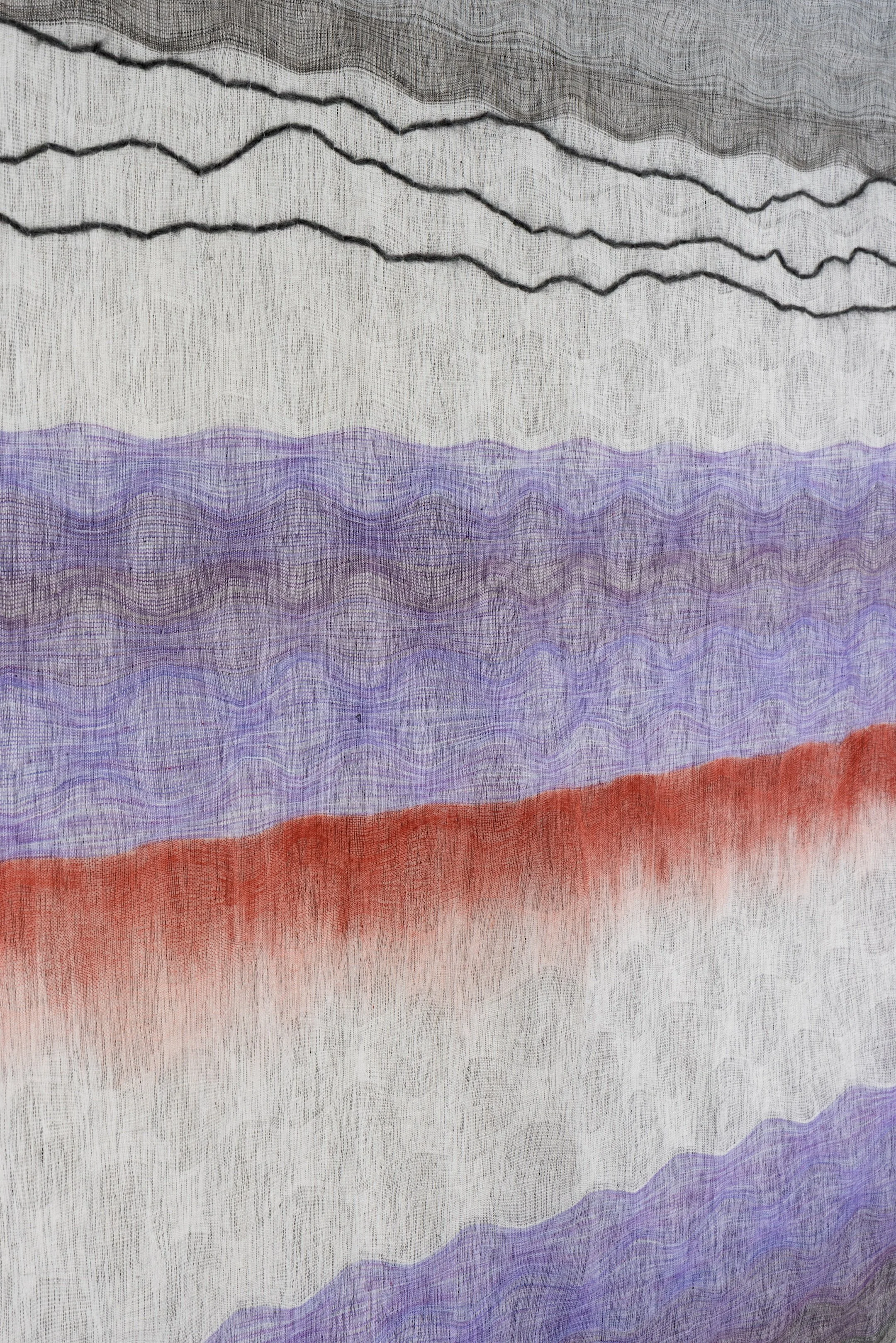
detail of Terra Feminarum